Envigilant Corporate Site
MY ROLE
As a designer in the team, I provide user experience aid to other teams and also create and maintain standards for the Design System Library. I am responsible for creating UX patterns, guidelines and standards for Envigilant Design System Library, being embedded on initiatives as a strategic and concept resource, and creating strategy and toolsets for domain teams to adopt and rebuild Envigilant with a new brand expression.
DESIGN EXPLORATION
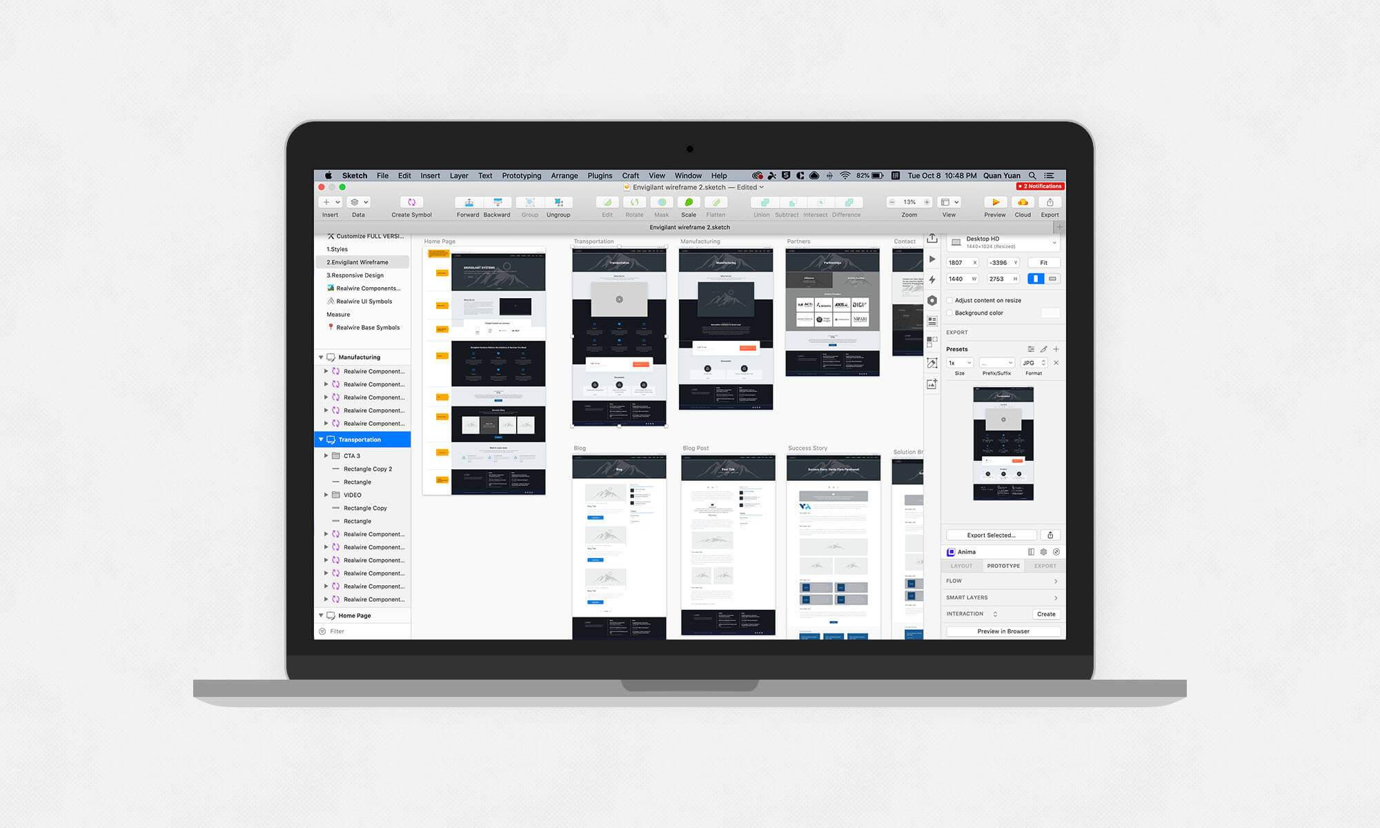
I started out experimenting from wireframe — discovering, establishing and stress testing a style(s) and library of components and patterns. The direction, user interface (UI) and style changed over time, which I’ve attempted to capture below to show the progression and the range of products tested.
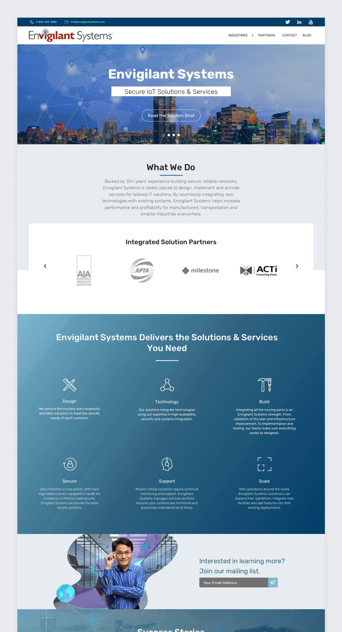
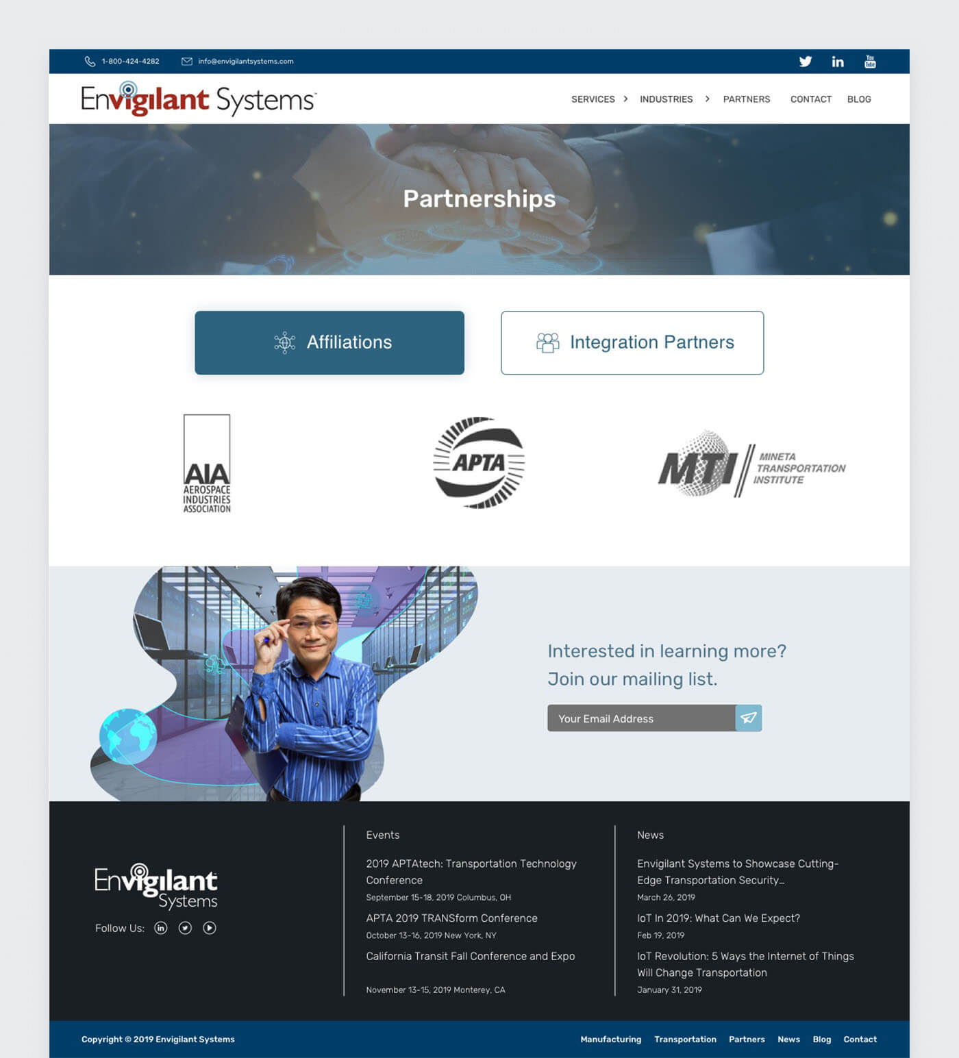
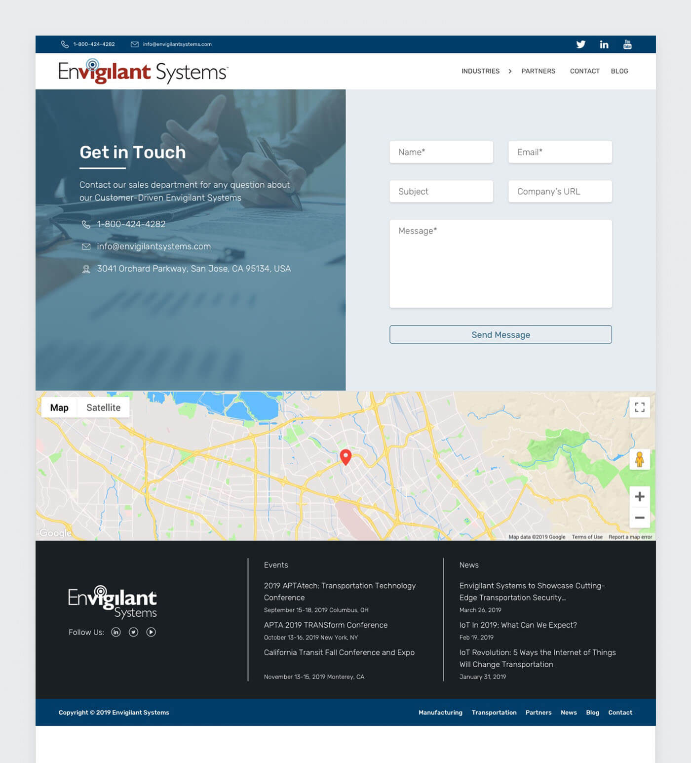
Simple, clear and clean
This site is web-based products. Simplicity, readability and load time are all paramount. We knew early on we were striving for a clear and clean aesthetic.
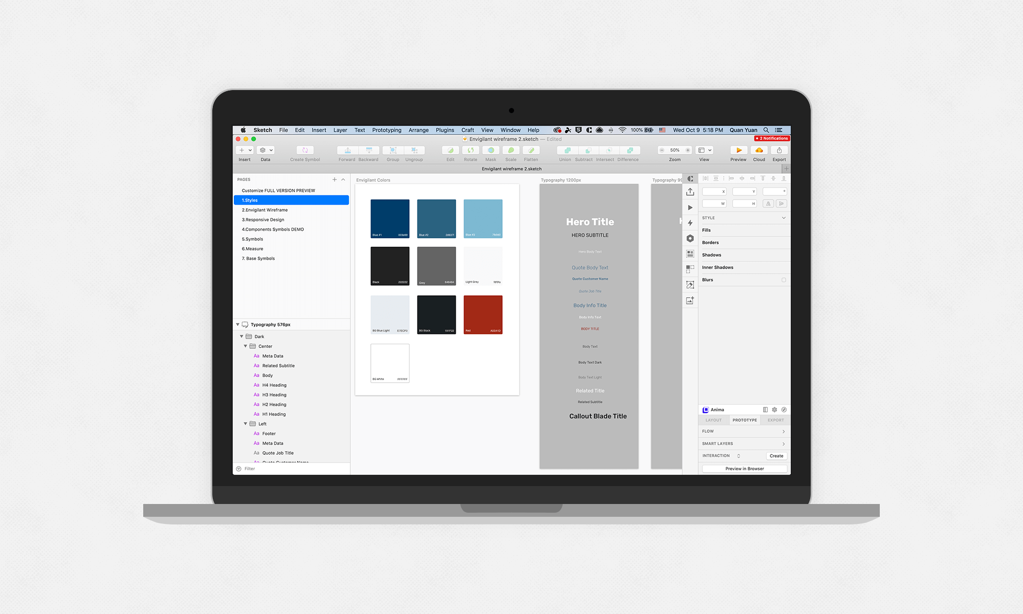
Color theory
The site is predominantly white, black and gray. It’s important the design doesn’t distract from the content, so subtlety is key. Blue is used for primary actions, since blue is one of Envigilant’s core brand color. Red is for warnings and alerts.
Typeface style
Envigilant uses Rubik font. Mac computers have Rubik pre-installed and any computers that don’t fallback to Arial (a similar, but web safe font). This is important, since no third party scripts are needed to load the font, meaning faster page load times.
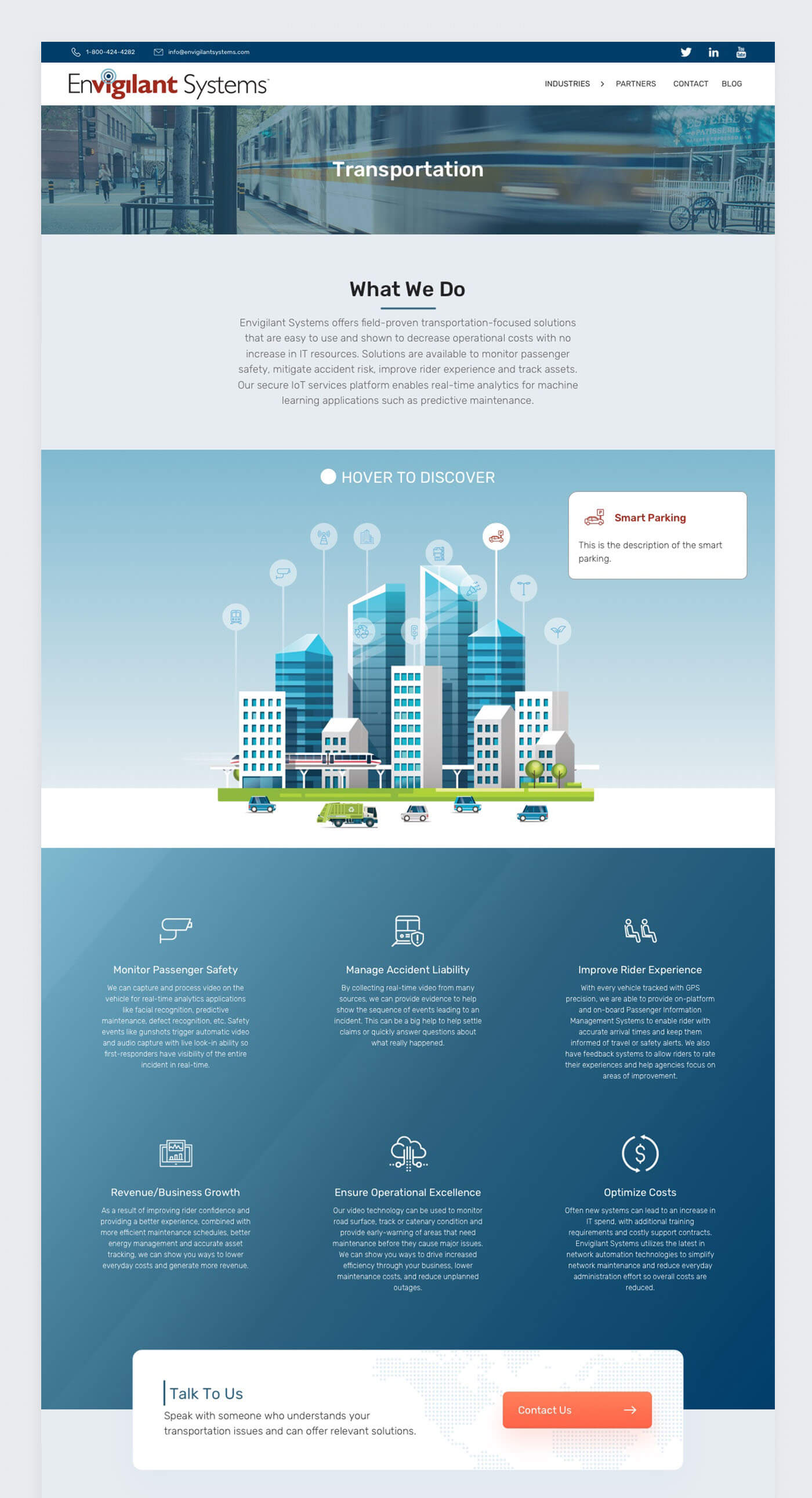
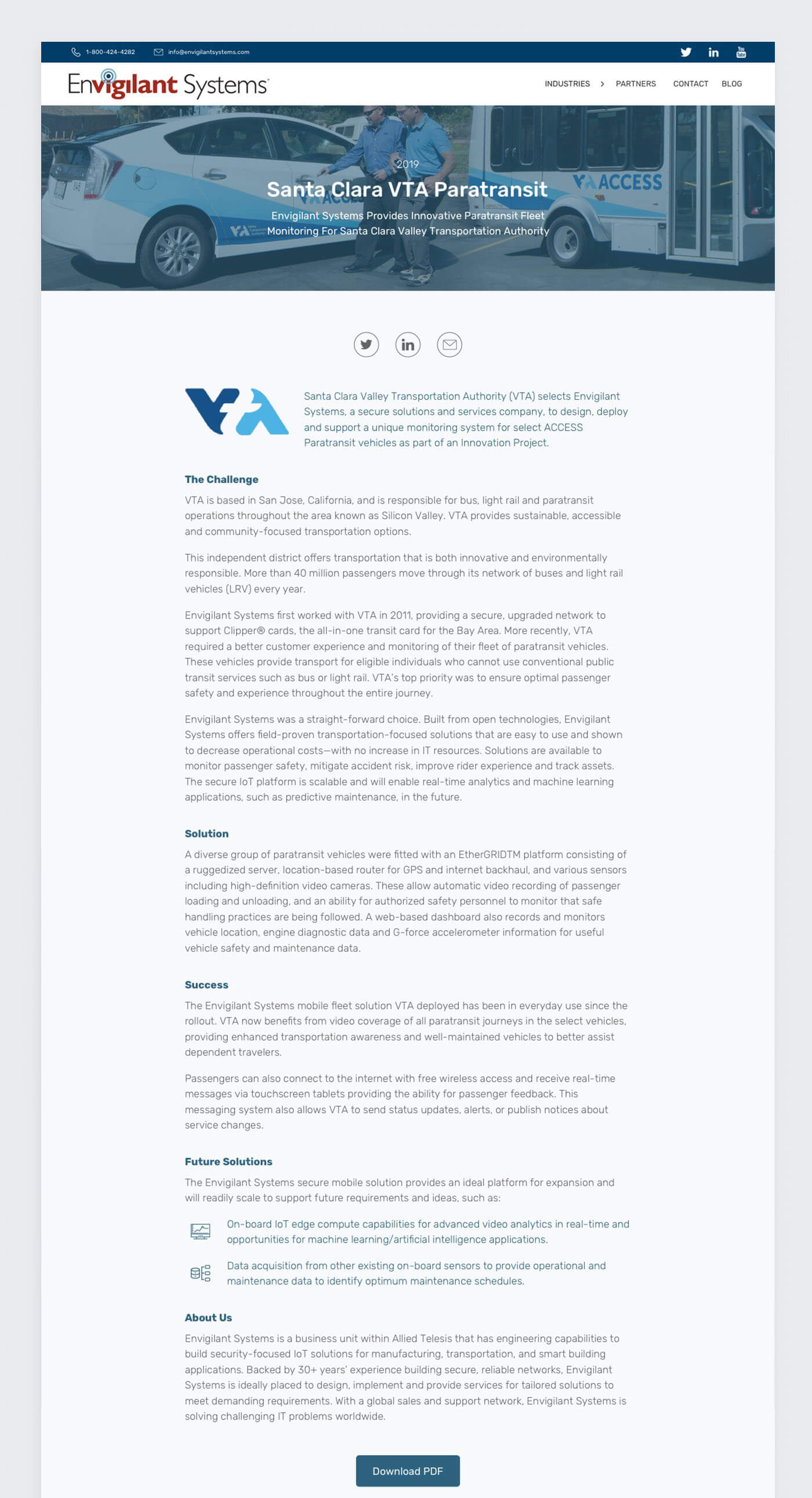
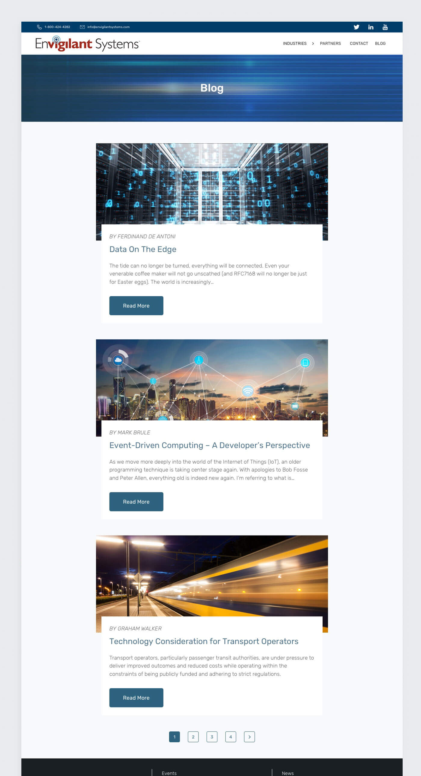
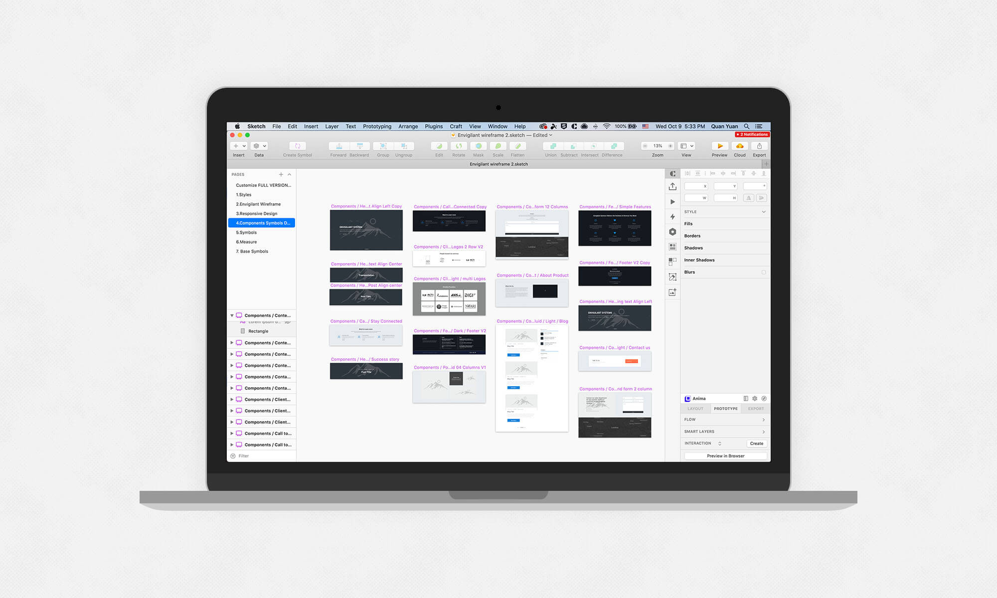
Patterns and components
After days of exploration, reviews and iterations, we arrived at a style we were happy with. The task now was to create an extensive suite of patterns and components, accounting for all states and scenarios — essentially creating a comprehensive UI kit for our team to use.
Our design system is made up of foundational elements like defined text styles for headers and content, a color palette, what we call patterns and components, and templates.
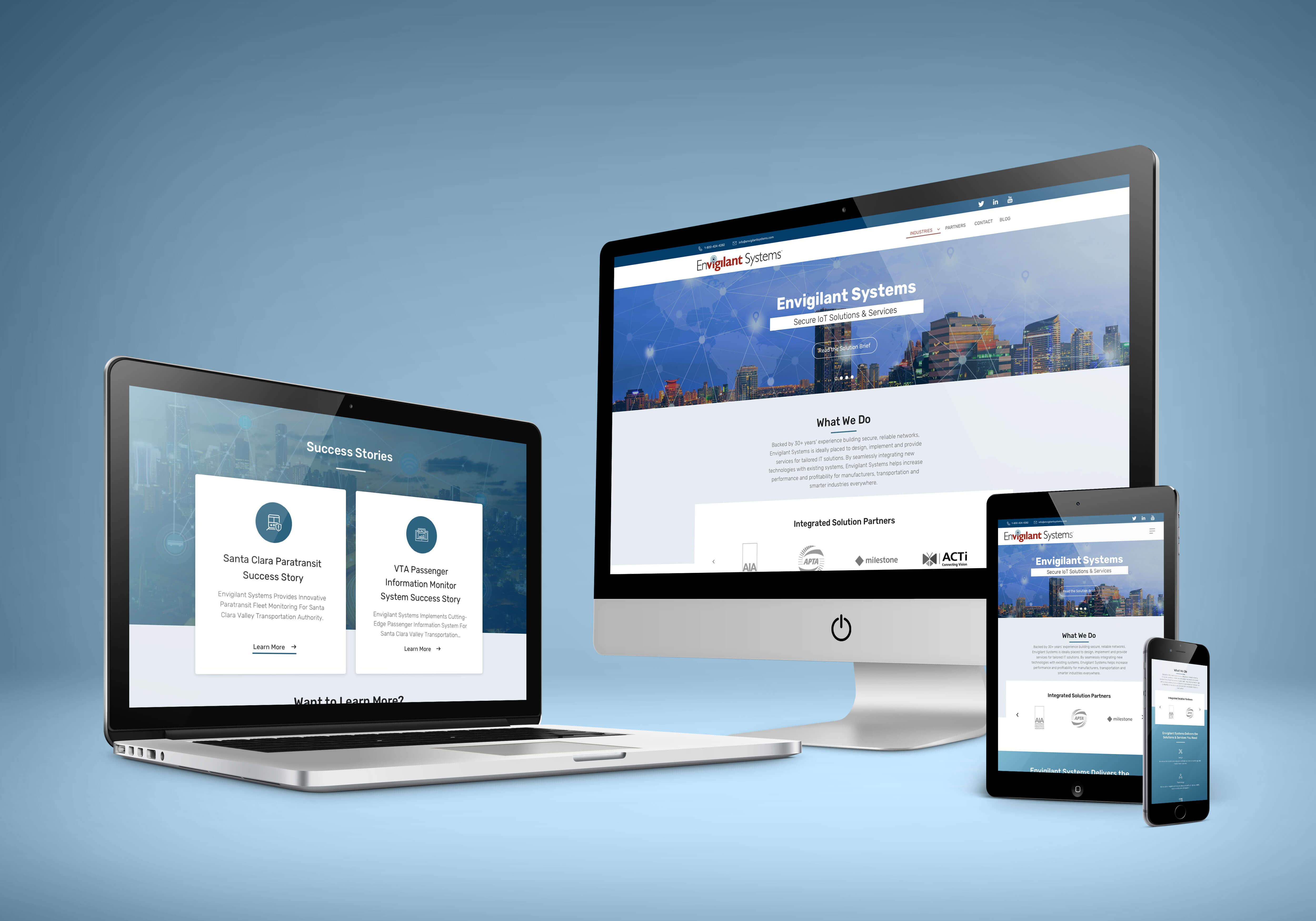
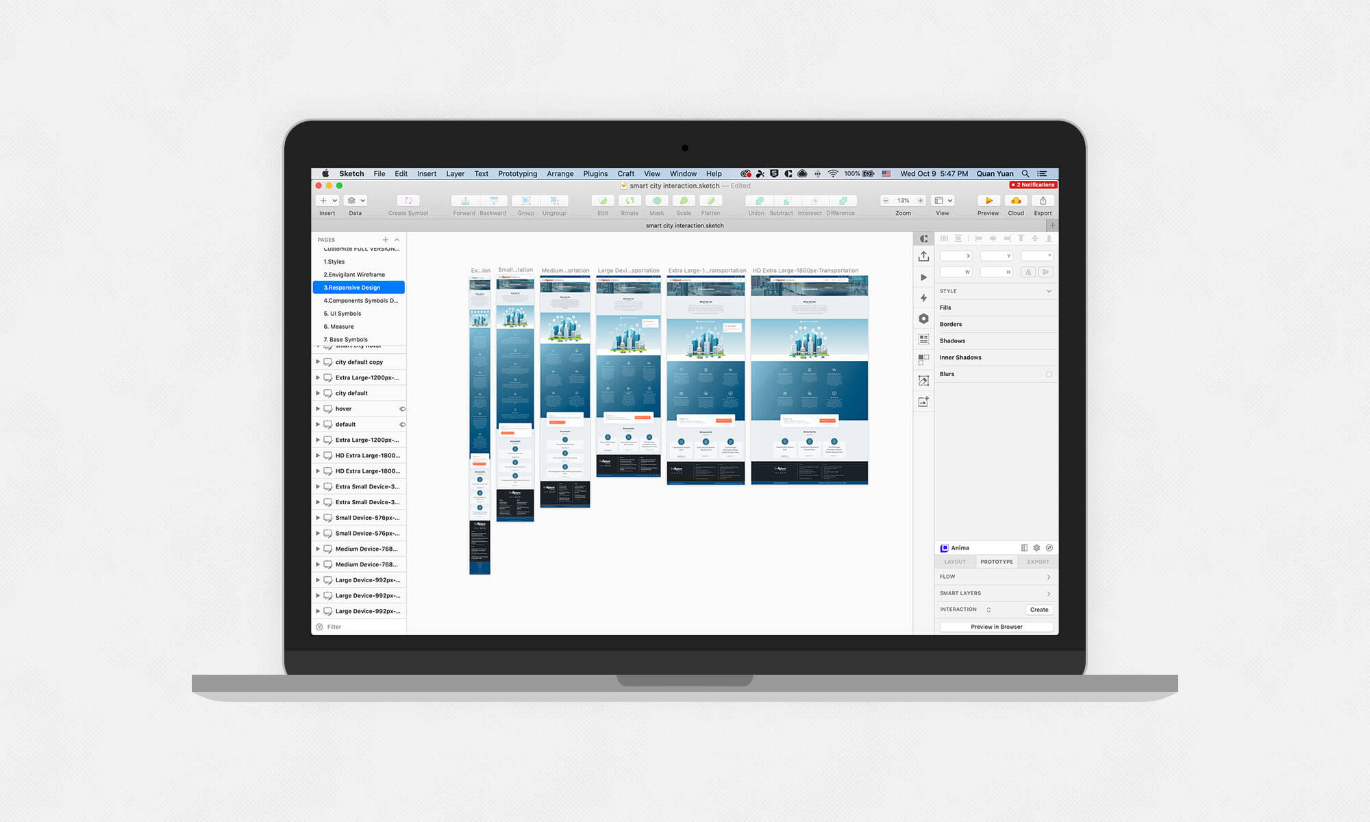
On responsiveness
Envigilant is designed to be responsive. It’s important to design web UIs that work at different browser widths. Using a combination of settings, groups and symbols, I can create a basic responsive UI in Sketch. While this would be helpful to creat mockup for each breakpoint.
Design and code
As designer I also understand how the developer's work, and familiar their language. This is would help to bridge the gap between design and engineering, make sure the quality of the product. Last but not least: One of the goals of this design system is to get designers, developers and product managers all speaking the same language. We can help to achieve this with consistent, semantic naming conventions we’re all familiar with (in the design and code), font styles, colours, UI patterns and components, templates or page names.